
This page was last updated on Tuesday, June 9, 2026. You might need to reload (refresh) this page to see the latest charts.
The Blog index will take you to Splits, Earnings and the Market charts.
This page is updated every day to show the overall market for the US stock market. The active top 6,000 stocks are represented in these charts.
From an investors perspective the Stock Market recently has been Medium Bull.

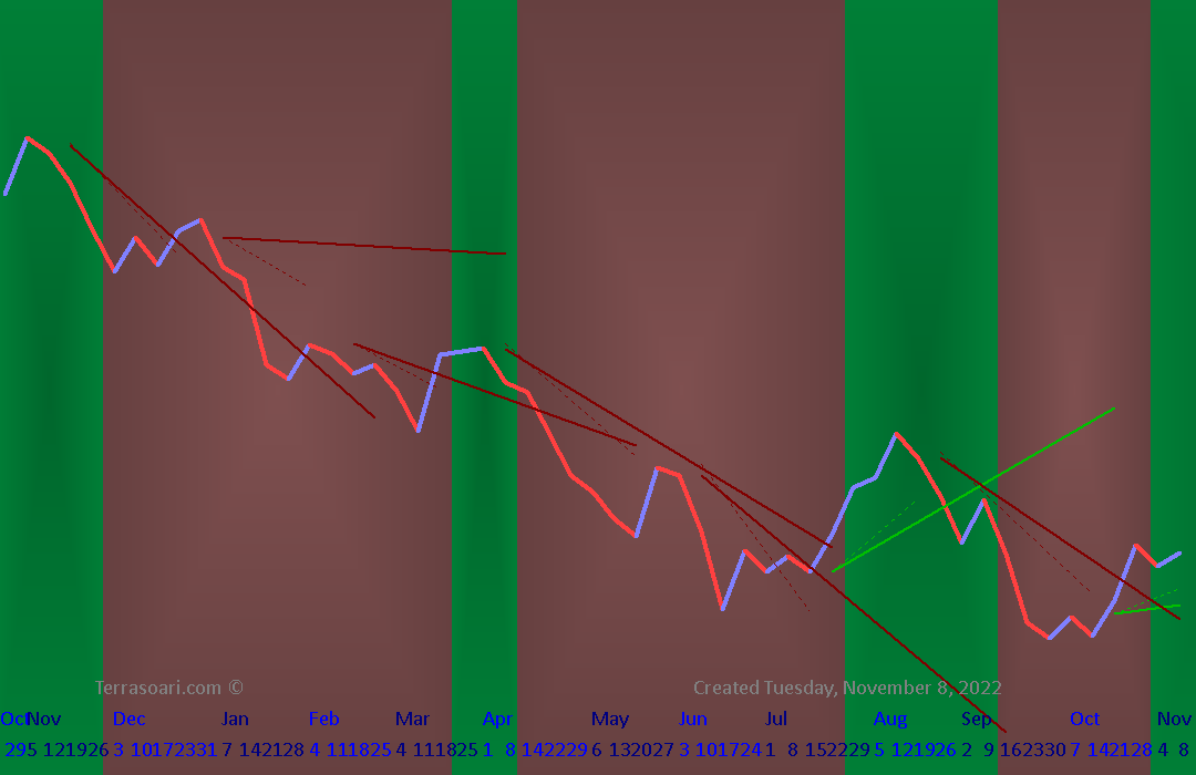
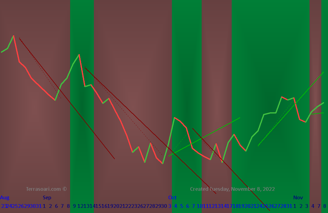
The colored background is for a general direction opinion. The opinion needs to be tempered by the Trend Lines which are the shorter straight lines over the jagged (singular) price line. If there has been a big movement in one direction, then a small pullback is expected and isn't normally a good direction to follow. We often need to wait for the long trend to convince us that it's truly over. Patience is a good idea. Knowing your time frames for investing is important. Its best to not be distracted by smaller the time frames.
The idea is that when the stock breaks to the OTHER side of the trend line, the move in that direction is probably over. You can get out with a profit sooner than waiting for the move to fail. The computer does its best to draw the Trend Lines, and a little thought from the chart-gazer (us), we can see when the reversing moves are shallow and barely breaking the trend lines that we might keep our position. The sharp and deep breaks across the trend lines need to be respected. That's telling us the market is not settled in a simple general direction.
For investors, I'd be suspicious of a green move after a long red drop. It needs to be a long rounded bottom to show support for a stable market. The short term (daily chart) is good for swing traders, but not investors. A longer chart (weekly chart) with a full year is needed to see the long term perspective well.